Iconify
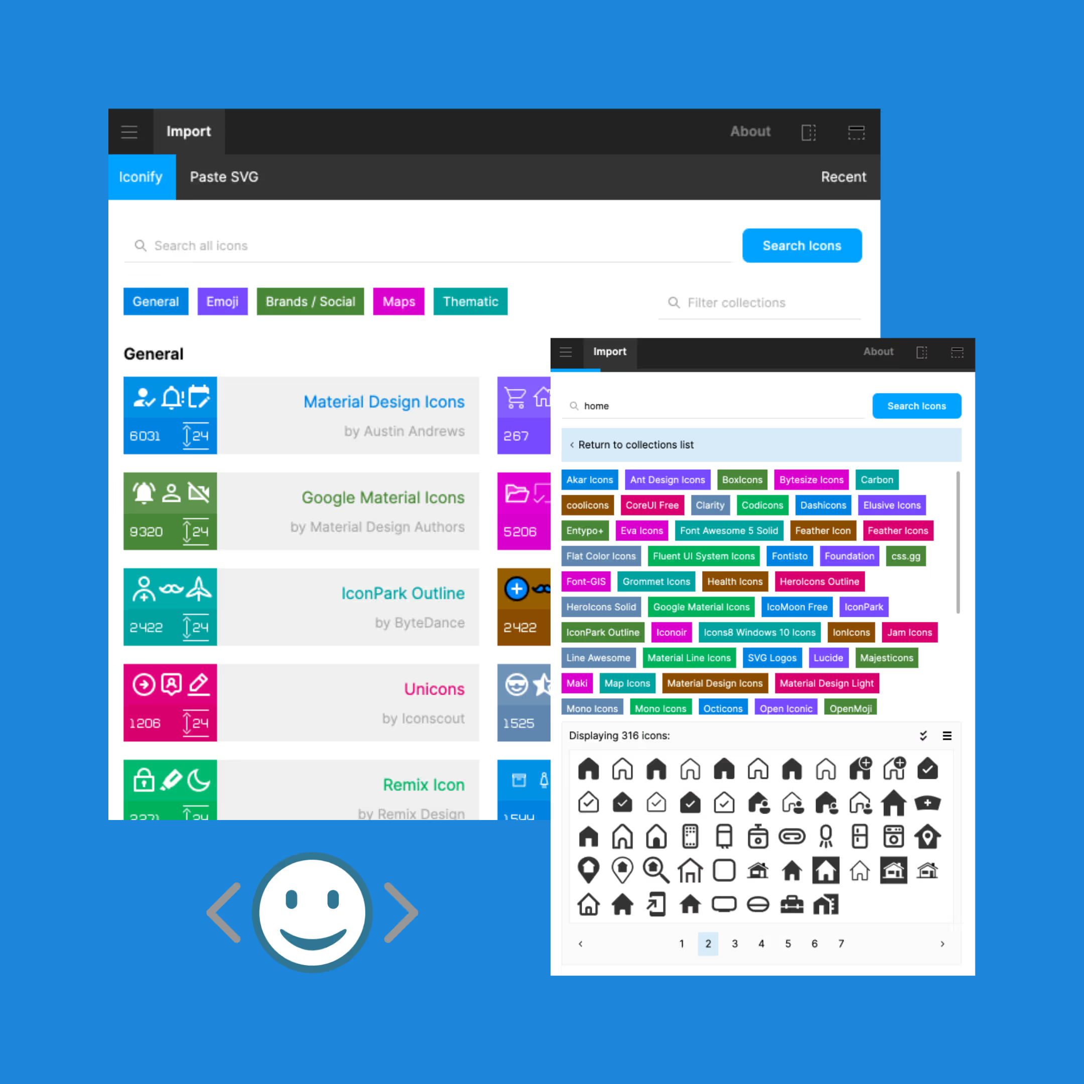
Not to play favourites so early, but in my opinion Iconify is one of the best things to ever come out of the Figma plugin community. With over 100,000 high-quality icons available, you can find the perfect icon for any project 99.99% of the time. Another great thing about Iconify is how many prototyping tools it is available for. While we use Figma, there is also a plugin available for Sketch. If you’re using another platform, you can browse and download SVGs directly from Iconify. It’s also worth noting that Iconify has a wide range of accessibility-focused icons, such as icons for different types of disabilities. It pulls from a wide variety of libraries that you can then filter and focus on (like Material Symbols, Material Design Icons, Google Material Icons), so you can make sure your icons are consistent. Start using it today, it’s that simple.
LORE
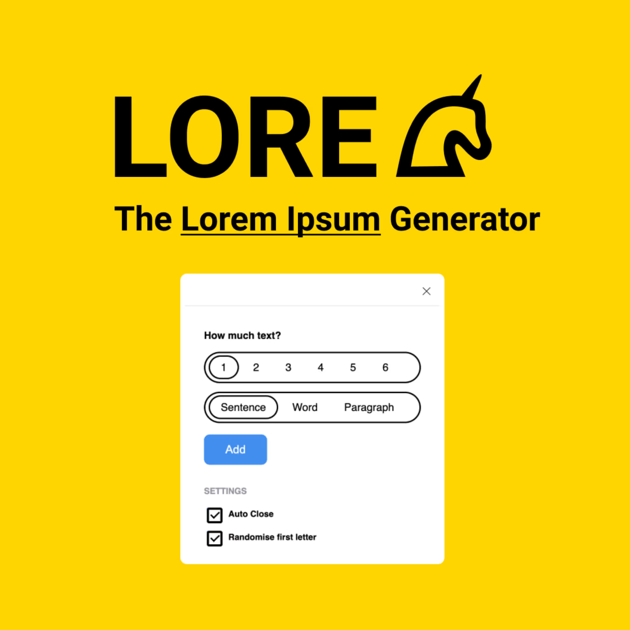
If you’re a designer, you are probably well acquainted with Lorem Ipsum. These passages of dummy or placeholder text have been used in typesetting and publishing since the 1500s, and are still going strong. Whether you’re showing designs to colleagues or clients, they’ll want to see the mockups as filled out as possible to see how the typography and styles look in action.
Speaking for myself, I couldn’t write a catchy headline or fun bit of body copy to save my life. Lorem Ipsum used to be a permanent fixture of my browser tabs, and I’d have to copy and paste it into my designs, figuring out how much I needed for each content block and editing it to fit. The beauty of LORE is that it generates the desired amount of dummy text in your text frame. You just pick how many words, sentences, or paragraphs you need, and boom. Massive time saver. You can also choose to randomise the first letter, so you don’t end up with the same block of copy repeated all the way through.
Avatars
Much like LORE, Avatars is a great plugin to make your prototypes feel as close to real examples as possible. If a user is signed in to your product, there will often be a visual representation of this via their user avatar. Avatars allows you to simply and seamlessly turn any shape into a user profile picture. The best part about it is that you can spam Command+Option+P until you find a picture that you like and works for your mockups. Using Avatars gets rid of the need to go and find stock images, add them to your file, mask or add them into the shape, and repeat the process if and when you want a different image. One click, done.
Unsplash
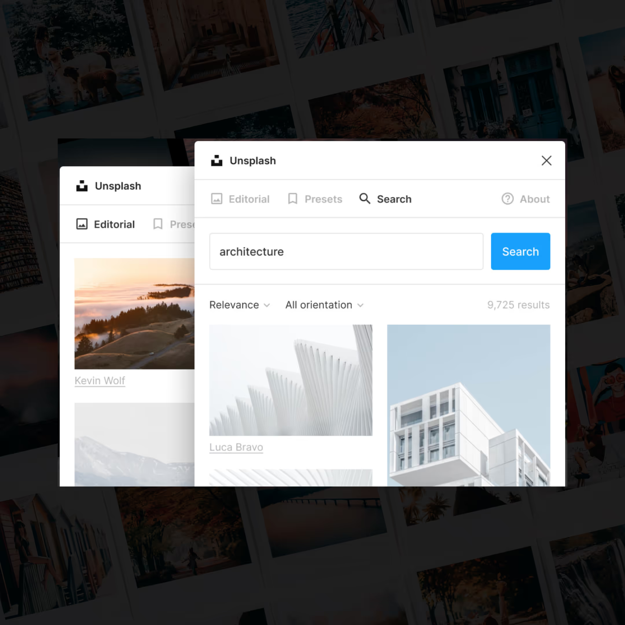
Unsplash is my favourite stock image site, and this plugin brings it to Figma in an effortless way. You used to have to go to the site, download each photo you wanted to use, drop them into your artboard, and resize or mask them into your image container. Now, you can just select the shape you’ve drawn and run this plugin to find and insert any image Unsplash has in its library. It’s honestly spectacular.
Tints and Shades
Choosing the right palette for your project is crucial for any design process, whether you’re a graphic designer, UX/UI designer, or a developer. Colour is everything, and once those core brand colours are chosen, creating the variants can be time-consuming and difficult. And as you might’ve guessed from the title of this listicle, we want to work smarter, not harder.
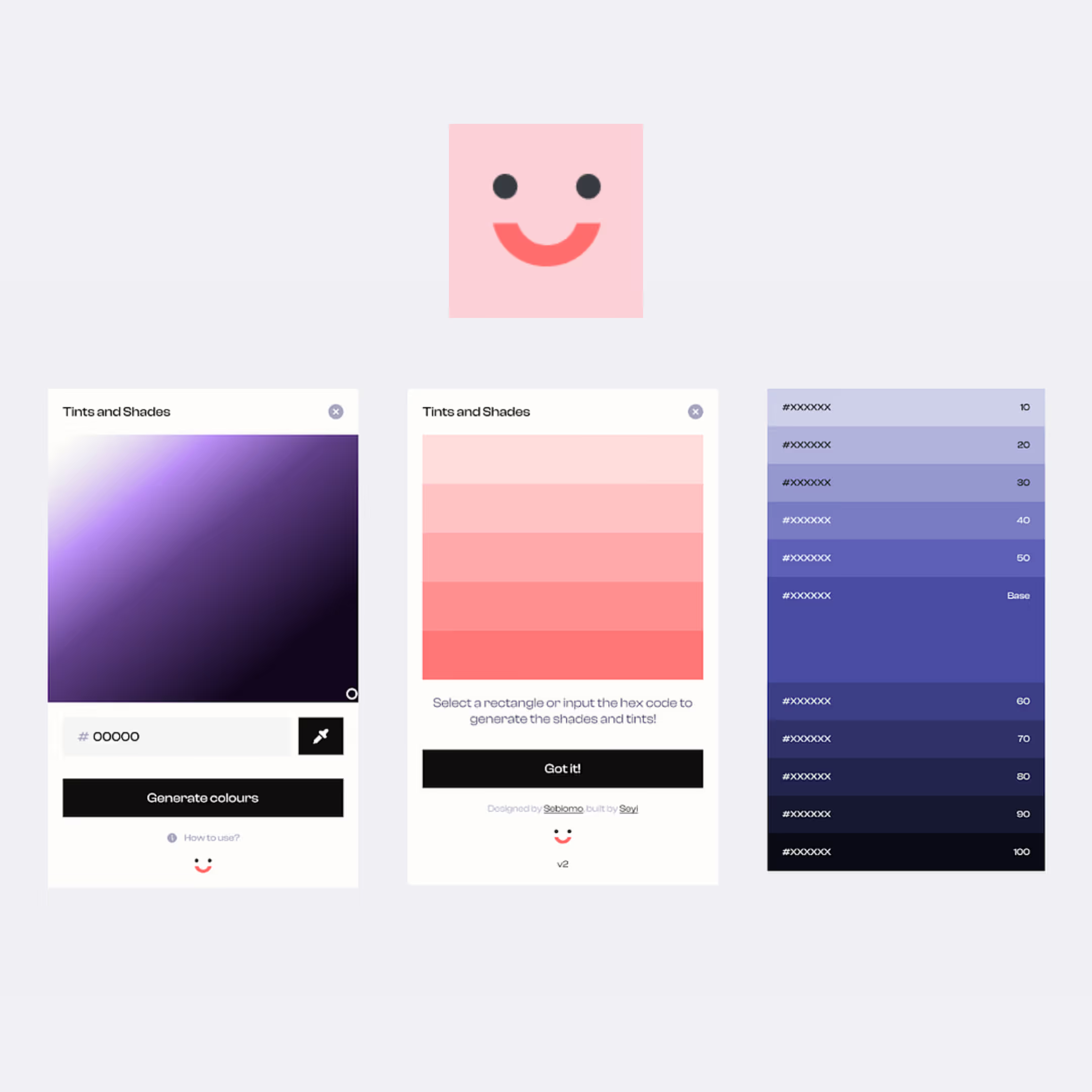
Tints and Shades makes it super easy to create a palette of 11 tints and shades of any colour. I always want to have a full range of shades for my core brand colours while developing a UI kit, but creating that palette can be a total headache. This plugin is beautifully simple, and useful for both junior designers with minimal Figma experience as well as seasoned vets. If you want to save time in your workflow and create seamless palettes, Tints and Shades is a must-have in your plugin loadout. If you’re interested, here’s the creator talking about conceptualizing and designing the plugin.
Stark
Accessibility should be integral to every project process. We know that great product design means working with users top of mind, and that includes all the different types of users along the spectrum of limitations and circumstances. Quick statistic break! There are approximately 300 million people in the world with a form of colour deficiency (when someone has a decreased ability or inability to distinguish certain colours). This is where Stark comes in.
Stark offers several tools for ensuring that your designs are suitable for a variety of visual impairments, including colour blindness and blurred vision. It allows you to check colour contrasts (for example, checking your main call to action colour against white for a button style), and checks your typography for legibility. It also gives you suggestions for colour combinations that are accessible if yours aren’t. There is a pro version of this plugin that gives you even more options, but the free version is incredibly useful and should easily earn a spot in your toolbox.

Wave and Curve
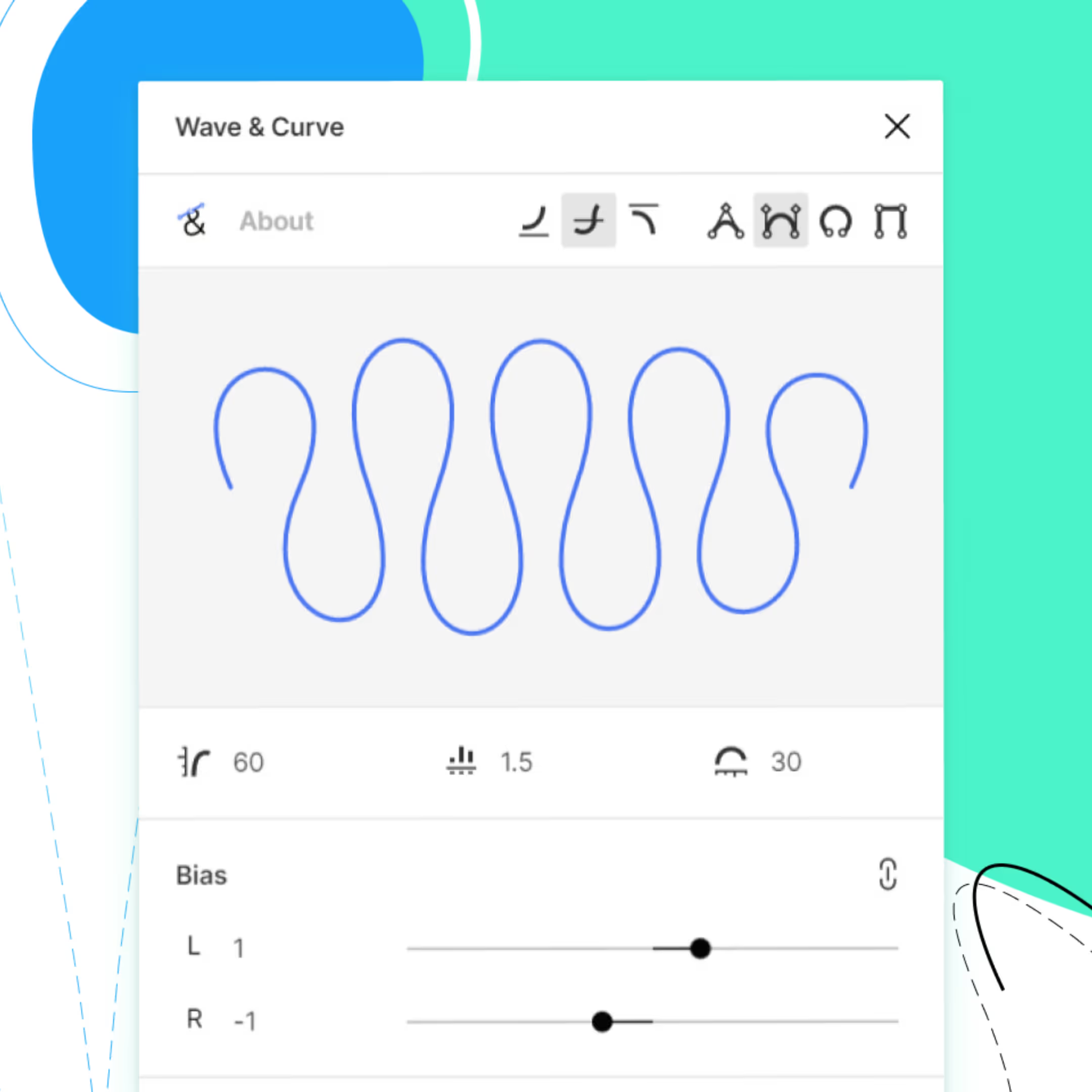
I’m not afraid to admit that I am pretty terrible with the pen tool. Specifically when it comes to making pristine flowing waves. Wave and Curve allows you to customize your lines, including the wave height, quantity, spacing, and more. It’s also great because once you add the line to your project, it’s really easy to go into the shape with the pen tool and make it a connected shape that you can then add a fill to. I feel as though I’d needed a plugin like Wave and Curve for quite some time, and now that I’ve found it, I’m compelled to add in waves and curved shapes whenever I can get away with it.
And that’s it! I hope this list has pointed you to that tool you’ve needed to plug holes, remove obstacles, or save time in your workflow. And remember kids; technology is supposed to help us work smarter, not harder. What it can’t do is add the creativity and empathy that only you can have.


